Great photography is an integral part of building strong brand presence. If you're a musician, a public speaker/figure, or small business, branding yourself is one of the most important things you can do to help grow your audience and customer base. One of the key facets of good branding is consistency. Having a standard set of type faces for your website, stationary, and other print material is a good example of consistency for a brand. Another good example of brand consistency is photography that not only looks appealing, but is also uniform across all the components of your brand.
To be more specific, here's an example of bad branding because of inconsistent photography: Lets say a startup coffee shop is building their brand. They've hired a graphic designer to create their logo, and hired a web designer to build them a nice website. They've selected all their usernames for their social media outlets, and even got an interior designer help them lay out their new shop. The owners of the coffee shop hire employees, and decide that they'd like to have some nice headshots for all their baristas to post on their new website. They also want someone to photograph the interior of their shop so their customers can see how beautiful it is online before stopping by.
Here's where things often go wrong for a brand. Because of money and time constraints, a lot of businesses end up up shopping out their photography needs to someone below the experience level needed, or worse, to multiple photographers with varying styles.
A second example: A local indie artist is looking to get off the ground and decides they want to start building their brand. Several of their friends are photographers and they all offer to photograph the artist for exposure. The artist thinks its a win-win, and gets tons of great, free photography for his site and social media.
The issue is, now his web presence is cluttered with widely varying styles of photography that represent him in drastically different ways. Lets say the artist is an electronic pop artist, who's stage presence and personality is very bright and colorful, but the photography he gets ranges from dark and moody to stylized and conceptual, with some natural light lifestyle mixed in. This paints a very mixed personality for the artist.
Throw all this together and you have one very, VERY confusing brand.
It's hard for your fans or customers to understand who you are as a business or as a figure if you can't brand yourself properly and keep your content consistent.
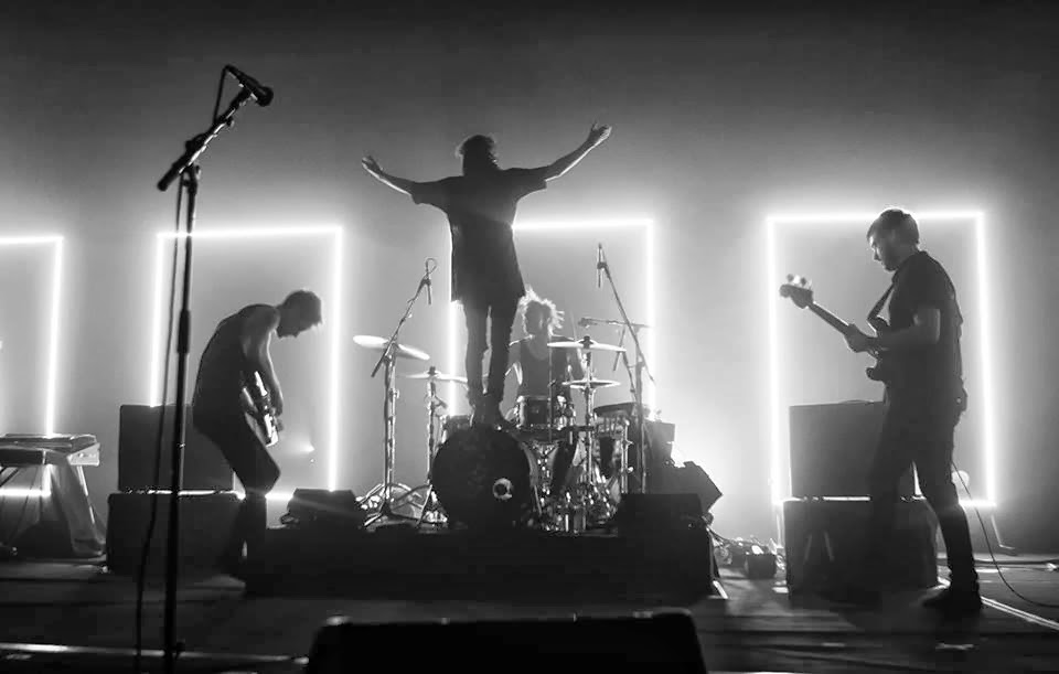
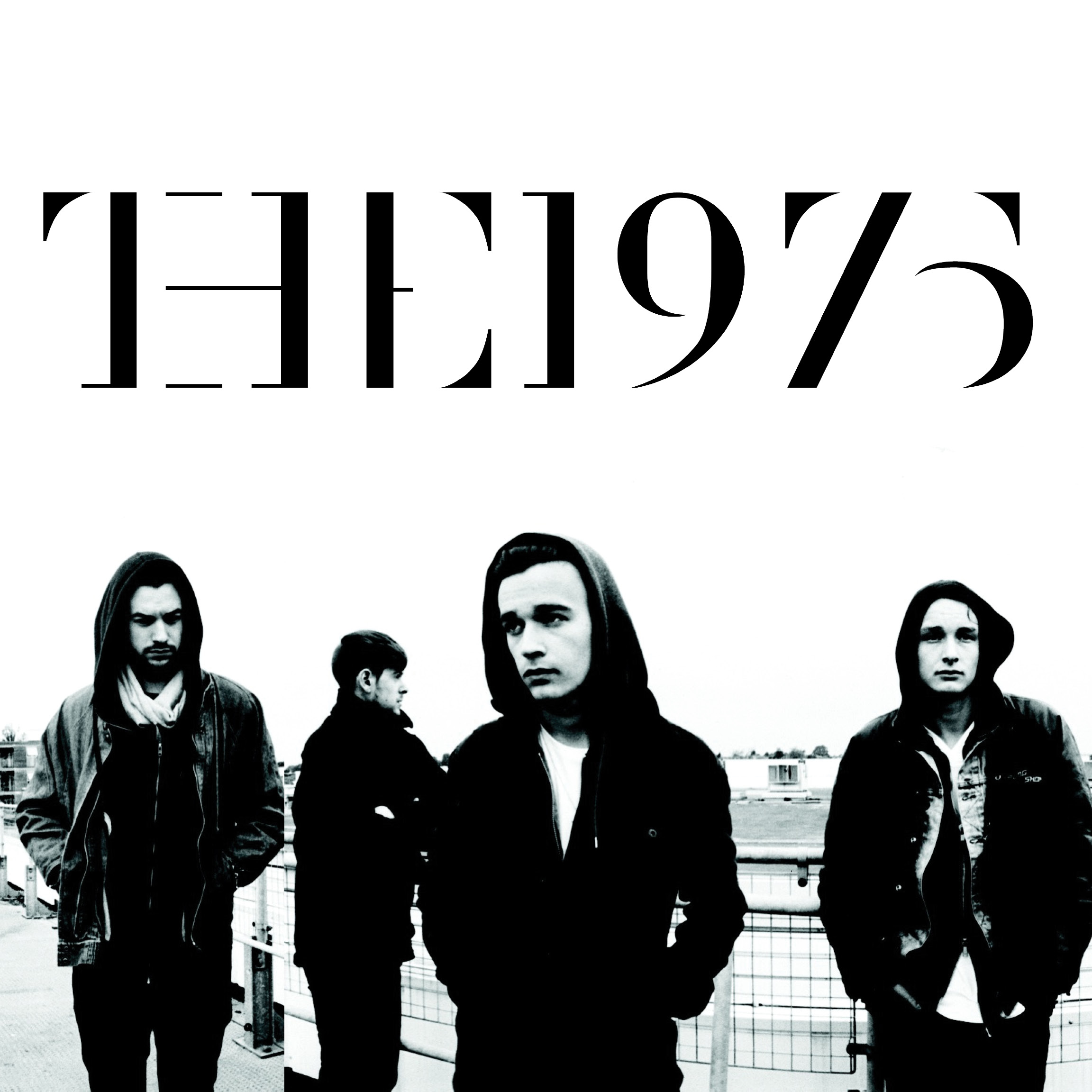
One of the best examples of consistent branding I've seen from a newer music act has been from The 1975. They have taken a simple idea (black and white) and brought it to every facet of their brand. From their website, to their social media, and even into their live performances, this clean, but grungy black and white design is the cornerstone of their brand. As a result, when you see content like this, the first thing you think of is "oh yeah, that's the 1975." Few artists and bands have pulled something off like this.
When you design your brand, the end goal is exactly what The 1975 have accomplished. You want people to see your content, whatever it is, and know it's yours without having to put your name on it.
Photography plays a very important role in this goal. Having photography that compliments your branding is absolutely necessary. So when you sit down to layout your branding for something big or small, whether it be a new website for a multi million dollar company or just a self funded EP cover for an indie artist, think hard about who you want to do the photography. When you settle on your photographer, stick with that photographer through the end of the project, or scrap him completely and start fresh. Don't mix and match.


